Well before the pandemic, the construction sector was worrying over what was perceived as an acute shortage of labor. Much of the discussion on this topic over the past several years has been anecdotal. Or reference has been made to employment gains that have been less than they should be and unemployment rates that have sometimes turned spectacularly low.
 But it would be better to find some easy-to-understand visual representation of the problem. It’s my hope that Graphs 1 through 5 below, making use of JOLTS data, fit the bill.
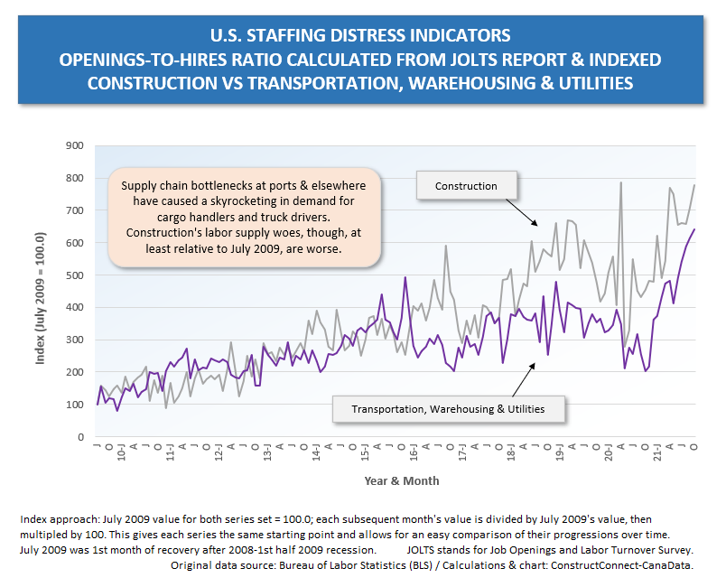
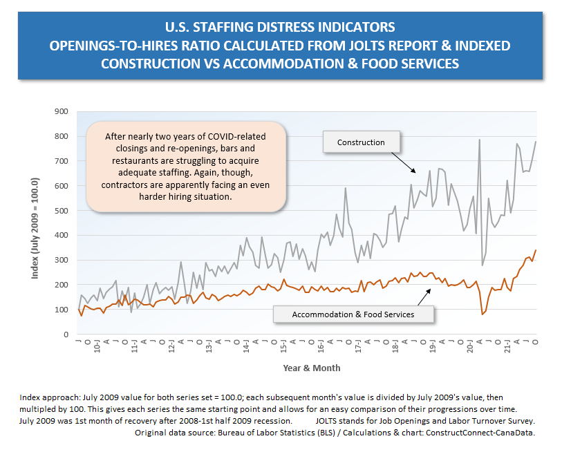
From the Job Openings and Labor Turnover Survey (JOLTS), for ‘all jobs’ and 14 major sub-sectors, I’ve taken ‘openings’ levels and ‘hires’ levels and calculated openings-to-hires ratios for every month back to July 2009, which was the first period of recovery after the ‘fiscal crisis’ recession (a.k.a., the Great Recession).
The openings-to-hires ratio essentially captures the degree to which vacant positions are being snapped up (a low ratio) or going begging (a high ratio).
To enable easy comparisons between industries, I’ve indexed their openings-to-hires ratios.
The indexing I’ve adopted takes the July 2009 value for each series and sets it equal to 100.0. (The number could just as easily be set equal to 1.0 but choosing 100 leaves more room for following numbers to move not only up, but also down, should that become the case.)
For each series, the value of each subsequent month is divided by the value in the base month (July 2009) and multiplied by 100.
Since all the series have the same starting value (July 2009 = 100.0), when a couple of them, or several of them, are shown on a graph, their movements over time can be readily compared.
In Graphs 1 through 5, I’ve stuck with only one-on-one comparisons.
The higher the curve, the greater the sought-after employee shortage distress.
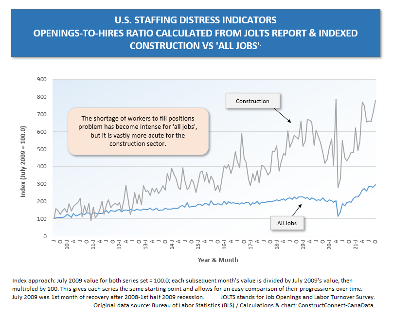
From Graph 1, it’s apparent that the increase over time, since July 2009, in the openings-to-hires ratio for construction has far outpaced the increase in the openings-to-hires ratio for ‘all jobs’. (The openings-to-hires ratio will increase in an expanding economy.)
By the way, I must point out that the patterns apparent in Graphs 1 to 5 stay essentially the same even when the base period is shifted (e.g., if January 2015 is chosen = 100.0 rather than July 2009).
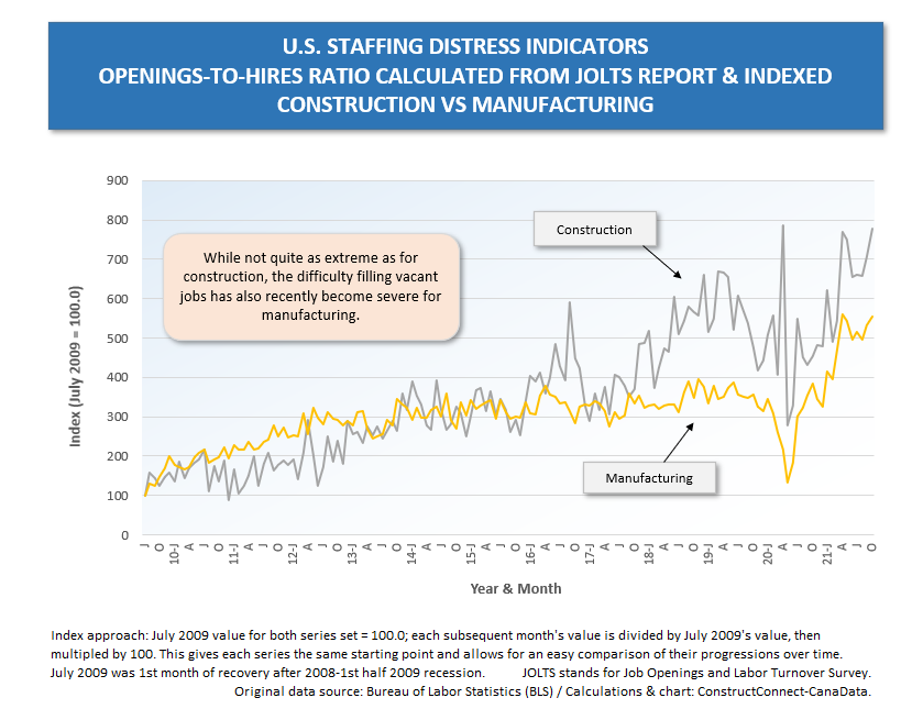
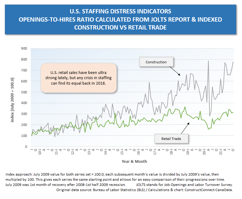
In Graphs 2 through 5, the worker shortage in construction is shown to be more severe than in the following: manufacturing; retail trade; transportation, warehousing, and utilities; and accommodation and food services.
As for nine of the other ten industrial sectors not set out graphically below, construction’s labor shortage is far more acute than in any of them except one.
The worst labor shortage in the U.S. is currently being experienced in another goods-producing as opposed to services-producing corner of the economy, ‘mining and logging’.
Graph 1
Graph 2
Graph 3
Graph 4
Graph 5
Alex Carrick is Chief Economist for ɫ��ɫ. He has delivered presentations throughout North America on the U.S., Canadian and world construction outlooks. Mr. Carrick has been with the company since 1985. Links to his numerous articles are featured on Twitter , which has 50,000 followers.


Recent Comments
comments for this post are closed